Wednesday, 8 May 2013

Evaluation of illamasqua project

Overall I am very pleased with the work i have created in this illamasqua project.
I enjoyed the process of researching, experimenting and creating my own designs and looks for such an iconic make-up brand.
It really showed me how exciting it must be to part of the illamsqua creative team coming up with ideas and concepts for their collections.
Although i liked my final images i feel that they would not be strong enough for a real illamasqua campaign and i wish i had pushed myself further creatively.
I also think that i should have got a proffesional photographer to take my images rather than doing it myself. I think this would have enhanced the quality of my work.
I also found that my fantasy look came out quite washed out on camera compared to what it looked like in person. In person i really liked the effect it created and felt that it really give the impression of rippled water effect. However this was not done justice on camera. I think that if i had tried out a test shot using the same camera i used in the shoot that i would have realised this and i could have made some changes.
However i felt that i have learnt from this and I am still happy with the final images i have produced.

Final Images

Head shot of beauty look

Mid shot of beauty look

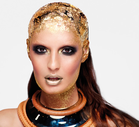
Head shot of fantasy look

Mid shot of fantasy look

Styling inspiration


Illamasqua is also known for their key eye for detail in their fashion styling as well as in their make-up and hair styling. Because of this it is important to consider the fashion styling within my images.
I have looked at styling in editorial images to give me inspiration for both my looks.
I feel that because my fantasy look it is so bold it is important to keep the styling really simple so that the focus is solely on the makeup. However for the beauty look i feel that i can experiment with colours and jewelery.
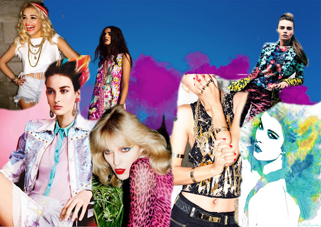
I have made moodboards to inspire me for the styling for each look.

Fantasy styling moodboard
This moodboard has really inspired me. I think that the best solution for the styling for the fantasy look is to make it very minimal and simplistic as to make the make-up and hair styling do all the talking. I will dress my model in a nude/skin coloured strapless top to give the appearence of nudity.


Beauty styling moodboard

I had a lot of fun creating this moodboard. I loved all the beautiful bright colours and patterns. I like the idea of using different blues,purples and greens in my styling as this also applies to one of the first words i used in my first research to reflect an underwater feel. I think that gold jewelery would compliment the look as well as giving the look a tougher street edge. This will keep the look modern. Which would appeal to the illamasqua audience.

I looked around the shops and found a crop top which this idea perfectly.
I also found some gold earings that are edgy enough to be used but not distracting from the look.


Hair inspiration

Hair is very important when creating an over all look.
Initially i wasnt sure what to do with the hair so i looked for some inspiration when thinking of hair ideas.


I found these images really inspiring and noticed different themes running through out them that i would like to include in my own hair ideas.
These were:
Texture
Panels of colour
Slicked back

I have also done some experimenting in the studio.
Here are some of the looks i have created on models and dolls heads
In this look i experimented with using rollers to help create shape in the hair. It would be interesting to expand this further creating more shapes in the hair and possibly adding colour.
In this look i experimented using different kinds of plaits through the hair. I could expand on this idea by adding smaller plaits through out the style and turning it into more of an updo.
I really like this look because of the tousled texture in the hair. It gives a sexy wild look which i think would work well in one of my looks. I could incorporate aspects of this look with other looks to create a unique idea for the hair.
This is my favourite hair look i tried out. I like the contrast of the sleek hair mixed with the textured wild hair. I think i will use this in my final looks. I think that adding colour to the ends of the hair would develop the look further and make it unique. I look forward to using this in my final images.

Experimentation with illamasqua products

Once i had decided on the looks i want to create i started to have a look at the products that i would use to help me create the effects.
Illamasqua has a fantastic product range and i looked through many of their products on the website before deciding on two pure pigments in beguile and Allivium.
These two pure pigments are shown here in this swatch.
They are both beautiful colours and will work really well in my fantasy look. I am going to pay around with them and some of my other products to create the desired effect i want for this look.
I also purchased two of the liquid metals from the illamasqua website.
I brought them in the colours in Electrum and surge.
The image is blurry but Electrum is on the left with surge on the right. They are both amazing colours and so strung in pigment. I love the texture of them and cant wait to play around with them along with the pure pigments.
This is a quick experiment i did using this products along with my aqua colours in blue and purple. I think that this gives a stunning effect that will work really well in the fantasy look.
Im going to develop this further by using different brushes to create different effects with these products.

Tuesday, 7 May 2013

avant garde look face charts


In this facechart I played around with trying out different lines and contrasts between colours. i also tried out the bold purple on the eyes to give the look a more dramatic feel. I also used light washes of green,blue and orange on the base of the face to give the look an interesting edge.

In this facechart i experimented with texture by layering products over each other. I really like the effect this created but i think that i would have to try this out on skin to see how it would come out. I kept the lips a simple blue along with the eyebrows to keep the look dramatic but not too intricate.


In this look I experimented with block colour against other block colours. I think the final result is really striking but may not be quite suitabale for my desired final look. I think that it looks a bit too over the top.

I experimented with using various different colours in this look I really like the effects of the different shades of blues against the golds. This is a an idea i would like to possibly use in my final look.

I really love this look. I like the contrast of the dark blue with the gold. I think the look is very dramatic but not too over the top. I think keeping some of the skin natural balances out the dramatic make up at the top of the face. The flecks of gold really stand out against the background and would create a really nice texture. This is the final look i want to use in my fantasy look. However i want to develop this idea further by using a silvery gold colour on the lips to tie the look in together.

Beauty look face charts

In this face chart i experimented with the idea of giving a graphic edge to the traditional beauty look of a smokey eye. I kept the rest of the look natural with natural glow in the skin. But added an interesting edge with a light metallic silver/gold lip.

I carried on with the idea of experimenting with the idea of a traditional smokey eye. However i added interest to the look with the gold swirled eye brows. I think this would make a really interesting look. However i think that this look might be quite difficult to photograph due to the light colours used. I think it would appear washed out on camera.

In this look i wanted to create a beauty look that still had the dramatic illamasqua edge.
I also think that these colour splashes would add a soft and beautiful yet colourful look.

I really like this face chart. I have combined several aspects i liked from previous face charts into one to create a unique beauty look. The purple smokey eyes will really show off the eyes. Whilst the eyebrows give the look dramatic edge. I also think the orange soft contour down the side of the face makes the look dramatic yet has a nod to the beauty look of contouring.
I will use this look for my final beauty look.

Avante garde - fantasy look

What is a Avante garde/ Fantasy look?

 An avante garde look is normally found in high fashion context's such as editorials in the pages of fashion magazines such as vogue, in catwalk shoes and in fashion blogs.
These looks are often out there, unusual mixing colours and textures. Avant garde make up tries to break the norm's of make up and fashion.
Illamasqua is a brand known for its avante garde looks.
Here are some examples of avante garde looks that have inspired me


In lesson time i also experimented with trying out an avant garde look.

 I really like this look that me and my friend created. We used only blue and yellow for the colours with a hint of gold. It was useful playing around and experimenting with different textures to see what kind of effects we could create.
This has also given me inspiration for my face charts. I cant wait to start creating some of my illamasqua looks!

Beauty looks

What is a beauty look?

The brief asks for a beauty look. To create good quality final images through my designs i need to understand what a beauty look involves.

A beauty look is focused on the models face and looks.
 It focuses on bringing out the models natural beauty.
Beauty looks are also commercialised. They are used to sell make-up and beauty products to the audience.
It is important to keep this points in consideration when creating the beauty look for the illamasqua campaign.
Beauty looks can still be high fashion and avant garde. It needs an element of it that can watered down into a commercilised look that can be sold.

These are beauty looks created by other people/business's that i can use for inspiration.


To further my understanding of beauty looks i also experimented with them in the studio.
I started off by creating a commercial beauty look with smokey eyes. I can then develop this look further and give it an illamasqua edge.


This is a glamour look smokey eye often used in commercial beauty shots. However since I am creating a shoot for illamasqua i need to make it dramatic and unique. So i could take this as a basic template changing the colours and shapes to create an illamasqua look.


I developed that idea further by using bright colours on both the eyes and lips.
I created a two tone effect on both the lips and eyes. I also played around with different textures. For example on the eyes the lighter blue is a cream illamasqua eye shadow with blue powder eyeshadow as the darker colour.

This created a really interesting effect but i felt that because of the differnece in textures it didnt blend very well.

Moodboard

 
This moodboard is inspired by the research i have collected and the ideas i particulary like. It helps me to gather my ideas together and It will also be referenced back to when explaining my ideas.

Illamasqua

When creating a new campaign for Illamasqua it is important to consider their past campaigns. To look at the how they expand on their theme within their imagery. This will also help me to consider the ways in which the campaigns are styled and presented. These are images from past campaigns i really liked.

Body Electrics


I think that these images are really beautiful and seem ethereal to me. I love the blending and merging of the colours into each other and the shimmer and glitter used onto the neck. I can also see how this can be watered down to create a commercial beauty look.


Art of Darkness


I think that these images are really dramatic and theatrical. I think that you can really understand the characters through the make-up and styling. Every little detail has been considered. I like the experimentation with texture that has been used particularly in the second image of this collection shown.


Toxic Nature


I think these images are amazing. Every single little detail has been considered and this really makes a big impact on the audience. The looks are very avant garde however aspects of the looks could be sold for a beauty look. Like the two tone lips. I also think that post production editing has been used to create the feel for these images. This is something i could consider when in post production of my images.


Art of Darkness


This is one of my favorite collections. I think the images are amazing and really tell the story behind the campaign. I love the mixed textures used throughout the make-up,hair styling of the images. I think it creates a really unique feel and look. I also think that the bold lines against the beautifully blended make-up is an interesting contrast that really works.


 Naked strangers


I feel that this collection really relates to some of my themes. I like how these images are quite different from other campaigns as in the background is plain and there seems to be less post production so the main focus is the beautiful makeup. I love the gold used in these images and think this would really relate to one of my words 'magic'.


 I'm perfection


This is one of illamasqua's latest campaigns and i really like the concept of imperfections as perfections. To me these images are beauty images with avant garde touches. They are very unique and I have never seen images like them before. I like how they are primarily close ups of the face so that the make-up is the main focus. This is something i will consider when photographing my ideas.